Survey Responses & Analysis
Eleven individuals participated in my survey, ten of them being part of my target audience by either being diagnosed or self-diagnosed with IBS or having a friend/family member with IBS. I am really happy that the majority of those who took part in my survey are the same people that would find the website beneficial.
After analysing the results the most important outcomes of the survey were:
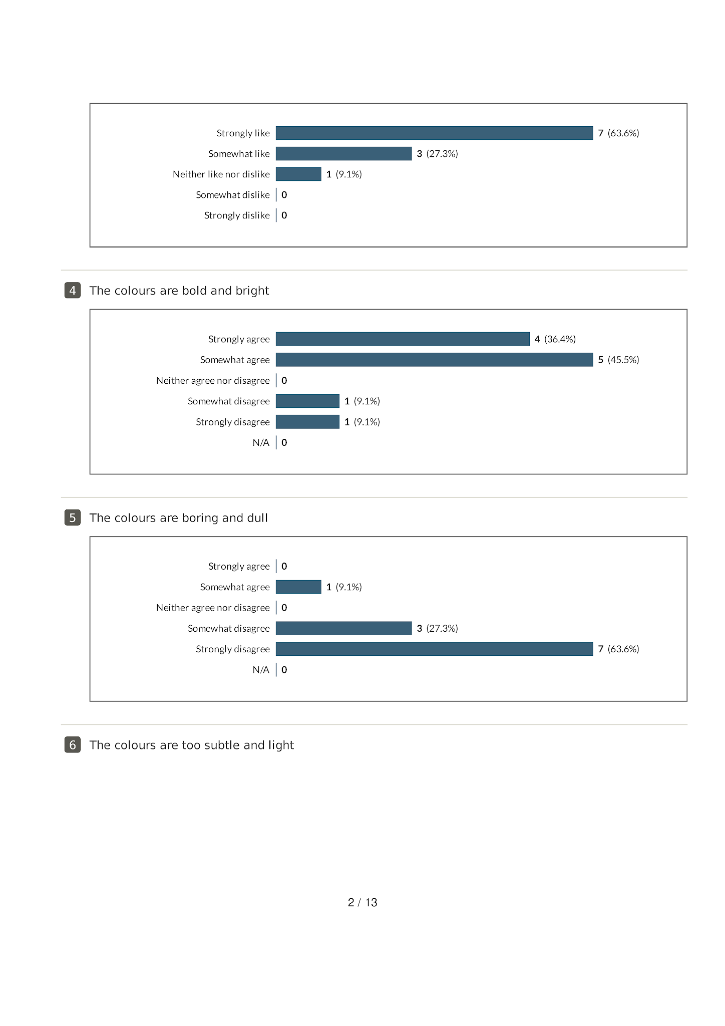
- 91% of participants liked the colours used, 9% answered neither like nor dislike.
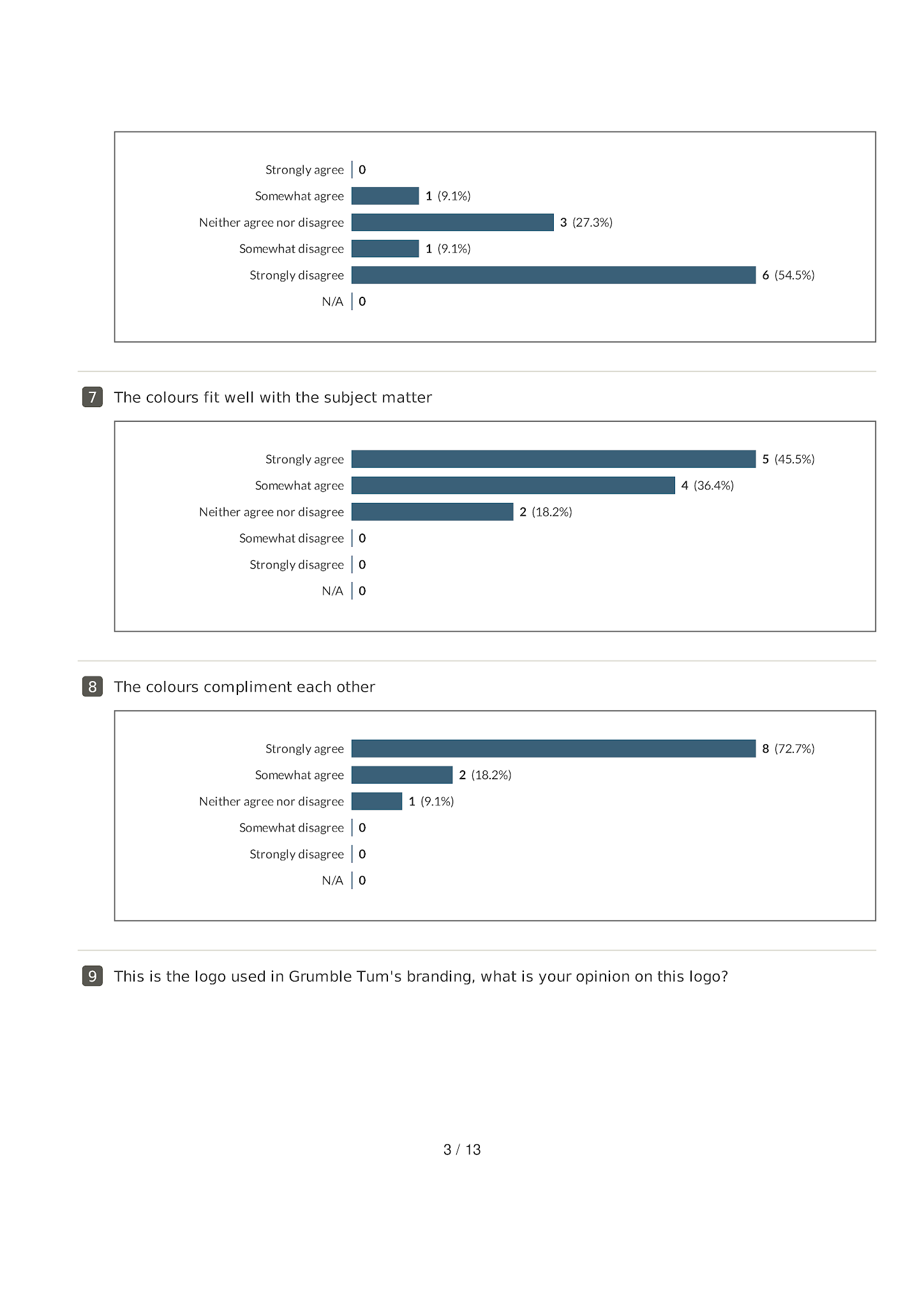
- According to the majority of participants the colours used were bright not dull or too subtle, fit well with the subject matter and compliment each other.
- All participants liked the brand logo & name.
- According to the majority of participants the logo used was fun and had personality but was not childish or too simple. The logo uses enough colour but an overall majority was inconclusive as to whether participants thought the logo was bright. This is understandable due to the nature of the question being too vague in this sense.
- 82% of participants viewed the website on a mobile device while 18% used a desktop device.
- 64% of participants viewed the website on Google Chrome while 36% used Safari.
- 91% of participants initially liked the website, 9% answered neither like nor dislike.
- All participants liked the colours used on the website and liked the illustrations.
- 73% were able to answer scenario 1 correctly, 9% may have answered this incorrectly by confusing the answer for the next question while the remaining 18% may have selected option 1 'homepage' because you can use the homepage to navigate to this section. Therefore they may have selected their initial touchpoint instead of the destination page. For example, this page can be found int he navigation bar on the homepage. Regardless all participants found the information requested extremely easily, which is evident in the written route responses.
- All participants found the information requested in scenario 2 easy to find but found it slightly more challenging than the previous scenario. 91% found scenario 3 easy while 9% found it somewhat difficult which may have been due to the nature of the question.
- In general, the majority of participants found the website informative, liked the simplistic design and colour scheme. More detailed responses can be found on page 11-13.
From my analysis, it seems that participants were able to navigate through the site easily and enjoyed the design elements of the website. This user test was particularly helpful to gain feedback on all aspects of the site which I can assume I have done very well. There is room for improvement however the website seems to be highly functional on all basis'.


