Final Website Comparison
I decided to write a comparative post, comparing my mockups and wireframes for my website.
My first initial observation is that the wireframes are a different screen width to the mockups, therefore the elements added aren't going to be entirely accurate in scale. The main changes from the wireframe are on the homepage as well as the header section header copy aligning to the left instead of right as it is easier to read left to right.
Navigation Bar
- Full logo with tagline is included instead of just the symbol.
- Navigation links are aligned in the centre instead of to the right.
Homepage
- Body asset spans over one section instead of overlapping over two.
- Copy from sections 1 & 2 are aligned to the left on the final website instead of the right.
- Getting diagnosed section is aligned to the right, with larger complimentary asset.
- Buttons have rounder edges.
- Low FODMAP diet buttons are in a row (however these become two rows once the screen width is reduced.)
- Support section is similar but the image assets were removed.
- Two new sections added before the footer on the final website including, 'Wondering if you have IBS' and the Social Media Instagram widget linking you to Grumble Tum's account.


Have I got IBS?
- This comparison has more similarities than differences.
- Header copy is aligned to the left instead of the right.
- Speech bubble asset added to the header section.


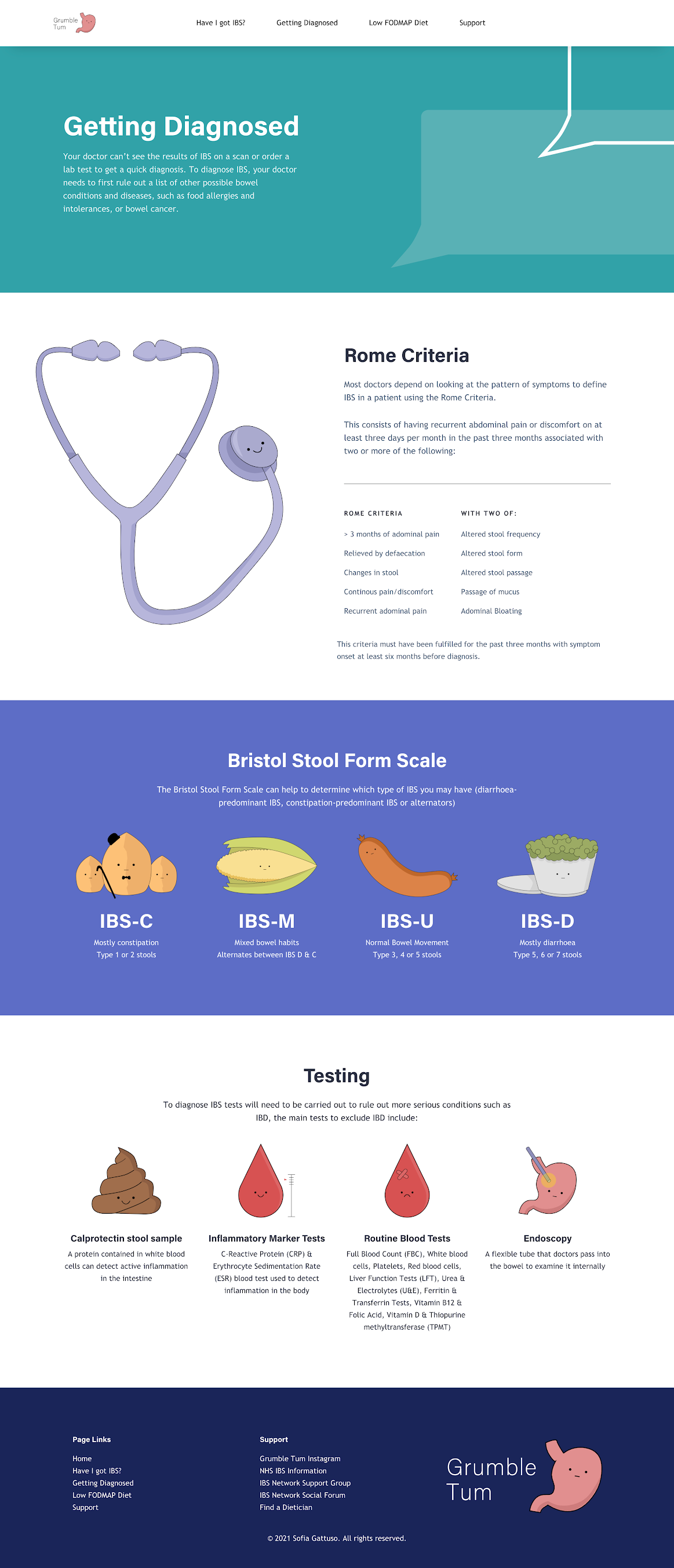
Getting Diagnosed
- This comparison has more similarities than differences.
- Header copy is aligned to the left instead of the right.
- Speech bubble asset added to the header section.
- More descriptive copy added underneath Bristol Stool Form Chart assets.

Low FODMAP Diet
- This comparison has more similarities than differences.
- Header copy is aligned to the left instead of the right.
- Speech bubble asset added to the header section.
- More descriptive copy added underneath each diet stage and food groups with limitations section.
- Social media widget included a button.
- Writing a food diary used one image asset instead of two.


Getting Diagnosed
- This comparison has more similarities than differences.
- Header copy is aligned to the left instead of the right.
- Speech bubble asset added to the header section.
- IBS stories social media widget and section added.
- More descriptive copy added underneath 'Daily Coping Mechanisms' assets.
- Interactive Toilet map added above footer.


Case studies page is no longer in use, and was later replaced by the IBS stories social media widget located on the support page. This works better as it takes up less room in comparison and reduces the overall amount of website pages.


