Posts

Degree Show

Image
As the degree show is not going to be held at the University of Hertfordshire due to COVID restrictions, the school of Creative Arts have created a website in which you can upload you work to showcase your final project. I personally thought this was a great idea as the online degree show in 2019 - 2020 had 40,000 visitors including potential employers - which is significantly more in attendance than a physical degree show. Therefore it was important for me to show my Degree Project in the best way I could. I finished my draft which I'll need to submit for approval before this goes live.

Showreel

Image
Using Adobe Premiere Pro, I cut both visual and audio elements together to suit the length of the showreel. As the video shouldn't be anymore than a minute, I decided to keep to this timeframe. This was  actually helpful as it forced me to keep projects that looked impressive or I was most proud of. I've happy with my showreel as I feel that there isn't any filler and I managed to add quite a lot of movement considering some of my work are stills/print based. After completing my showreel, I uploaded this to YouTube where I featured this on my channel. This means that my showreel will be the fist video that potential subscribers/employers will see. I decided to use a song named, Shelter by Porter Robinson & Madeon. With permission from Dean, we were allowed to use a published song or soundtrack. I liked this song in particular because it was upbeat and I thought it sounded as though at intervals that the song repeated 'wonderful' which is how I would like my work...

Updated Portfolio website

Image
After gaining feedback from Dean about my portfolio website, I wrote down what aspects of the website needed improving on a Trello Board. This helped me keep track of my tasks which aided my workflow. This was split into five lists consisting of:  Checks To Do Asset Size Reduction In Progress Complete Some images took an unusually long time to load on the website, and therefore needed to be reduced in weight. This meant reducing the dimensions, quality and sometimes file type to reach an optimal weight of 500kb. At this size, images can load faster on the website without overly disrupting the quality. Making these improvements dramatically changed the look and feel of the website, and feel visually appears more consistent than it was previously. Further improvements will definitely be made in the near future but at present, I'm quite happy with the outcome of the site, especially considering this was coded from scratch.

Job Hunting Strategy Update

Image
As I have been looking more into the types of job opportunities that are available to me, I have added more jobs/companies to my job hunting strategy list. This included adding a section where I list connections that have either worked at the company previously or are currently and the careers page for each company. Knowing the types of jobs that each company has offered past or present is useful as it allows me to look for similar opportunities at that company.  As these job are entry-level, they  may be reposted in the future, as people progress through their careers.

Branded YouTube Channel

Image
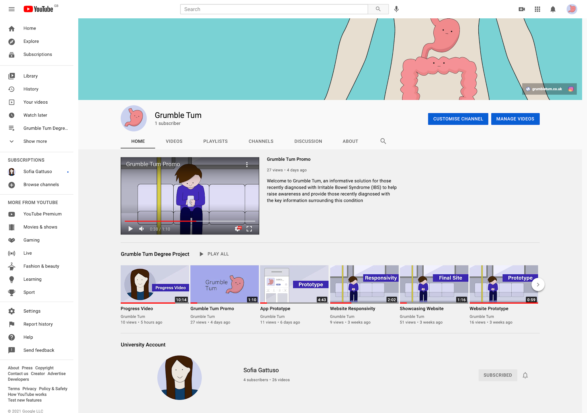
I decided to rebrand my YouTube page, so that my branding is consistent across all platforms and promotional material. As I've had this same channel since my first year of uni, I decided to organise my videos into projects so that it is easier for a potential subscriber or employer to navigate. Furthermore, I have featured the channel, 'Grumble Tum' which was used to upload videos regarding my degree project. I am happy with the way my channel looks, I feel it looks professional and well structured. Once I've completed my showreel, I will feature this video on my channel as promotional material.

Degree Show Risk Assessment

Image
It is unlikely that a physical Degree Show will go ahead due to COVID restrictions however, I created a risk assessment to access the potential risks that individuals would be exposed to while viewing my project in person.

Evaluation

 “The idea behind Grumble Tum is to inform individuals diagnosed or self-diagnosed with Irritable Bowel Syndrome (IBS) the key information surrounding this medical condition in a friendly manner (Gattuso, 2020, p.3).”   When exploring my project prospectus, throughout I can identify the main ideas that I wanted to achieve in my final artefact. The key themes of providing education, self-acceptance, societal awareness, and a light-hearted tone were prominent in realising the main objectives when designing/developing my final artefact. Having experienced IBS flare-ups since November 2019, this project was a personal journey in uncovering the information I should have known post-diagnosis. Faced with a medical pamphlet and an abundance of websites, I naturally felt overwhelmed at the plethora of information. I believed this contributed to the ill effects of my condition, as this was an especially stressful period. Therefore, creating a middleman between the lack of information at...

Third Party Resources for Grumble Tum

ADOBE CREATIVE CLOUD. (2021).   Welcome to Creative Cloud.   [Online] Available at: https://creativecloud.adobe.com/cc/   ADOBE FONTS. (2021).  Adobe Fonts Acumin . [Online] Available at: https://fonts.adobe.com/fonts/acumin   ADOBE STOCK. (2021).  Adobe Stock Find the perfect stock asset for your next creative project.  [Online] Available at: https://stock.adobe.com/uk/   ADOBE. (2021).  Adobe . [Online] Available at: https://www.adobe.com/ ALLERGY SHOW. (2020).  Allergy and Free-From Show . [Online] Available at: https://www.allergyshow.co.uk/   AMAZON. (2019).  Monash Uni Low FODMAP Diet . [Online] Available at:   https://www.amazon.com/Monash-Uni-Low-FODMAP-Diet/dp/B07NQV376L   ANIMA. (2021).  Anima Design & development, united at last.  [Online] Available at: https://www.animaapp.com   ANIMA. (2021).  How to Avoid Blurry Images, use Retina Images, and Vectors (SVGs) . [Online] Available at...

Progress Video

Image
I decided to create a video to showcase my workflow and progress throughout this project. The purpose of this video is to better explain and highlight each stage of development from planning to the design. This is important for individuals/potential employers as it shows my project in depth in a format that is easily accessible.

Updated YouTube page (Branding & Layout)

Image
I decided to update Grumble Tum's YouTube page ensuring it had a cover, about section and each video had relevant thumbnails. By keeping to my branding, colour palette and fonts, I created a page that looked visually appealing and professional. I removed the uploaded videos section and replaced it with a playlist that included all the videos of this project. This allowed me to include the Initial Technical Prototype video that was uploaded on my University YouTube account prior to the creation of this dedicated channel. I added a section that shows my University YouTube channel, in case a potential employer views my page and wishes to see videos from my previous projects. I made sure to add my social media links and the link to Grumble Tum's website.

Anima App to Xcode

Image
After completing the prototype for Grumble Tum's mobile application, I was under the impression that I would be able to export the code and import the design into Xcode to edit as a useable app. This unfortunately was not the case. Although Anima did have this feature (see video below), this has since been removed. Beforehand, you were able to export your designs and upload them to GitHub, creating a storyboard file in the process which Xcode could read.  Therefore as this functionality was removed, I could only export my design into HTML/CSS or React.js code, which can be opened in an IDE. This is still useful because I could give this code to a developer to convert into an app without sacrificing the design however it would have been optimal if I was able to deploy this myself. OR ARBEL. (2016). Sketch to XCode by Anima (Preview). [Online Video]. November 23rd. Available from: https://youtu.be/ya7vDcBBndw

Final App Prototype

Image
I created this prototype by first creating mock-ups in Sketch and linking the screens together with a plugin named Anima which worked in Sketch internally. This plugin was intricate and sometimes problematic to use. Specifically problems occurred:  When previewing some illustrations in browser mode. This would make the illustration blurry. More frequently when the illustrations were being viewed in a mask. To combat this, you needed to 'trick' Anima into thinking these files were ready to be exported. Some button links that used an entrance animation stopped working when grouped together. These then needed to be ungrouped and linked individually. Custom animations not working as expected or unexpectedly stopped working with no apparent reason. Re-creating the animated frame, made this work again. These problems really slowed my workflow as I would need to troubleshoot problems often by looking for support online from others experiencing the same problems. However regardless of ...

App Prototype Comparisons

Image
I thought it would be interesting to draw comparisons between my initial app mockups and my updated  mockups. As the updated mockup has significantly more screens, I have only included the screens that directly compare to my initial designs. Home Purple background header removed. Tagline shortened. List of icons reduced from six to four. List of icons originally circular with a border outline now rectangular. Different colour scheme, now solid blue. Icons included coloured illustrations, now follow a light purple colour scheme. Icon illustrations and titles updated. Have I got IBS? Pale green header background changed to darker green. Icon removed from header section. Image asset added to content (copy). Icon buttons background colour change to solid blue. Icon buttons order and titles have changed. IBS Symptoms Pale red header background changed to darker green. Icon removed from header section. Icon buttons removed and replaced with image asset. Getting Diagno...

Application Mockups

Image
I created a series of mobile application mockups specifically for iPhone 6/7/8/SE.  I made this decision because: I only had full access to an iPhone SE while I was developing the application for this project I didn't want to risk designing an app for a device I was not able to test it on. The iPhone 6/7/8/SE all use the same screen size. This allows my app to be used on a variety of devices and not just one model. I am very happy with my app designs, they use a consistent layout and colour scheme throughout which mimics the website. This is useful as the user will be able to relate this branding to the same property. No Wireframes? As I had already created the initial technical prototype for the previous assignment, I already had a rough idea on what I wanted to achieve with the layout. It was more the visual aspects that I needed to perfect. Therefore, I did not feel the need to create a series of wireframes for this part of the project and jumped straight to high fidelity mockup...

Functional Testing (App Prototype)

Image
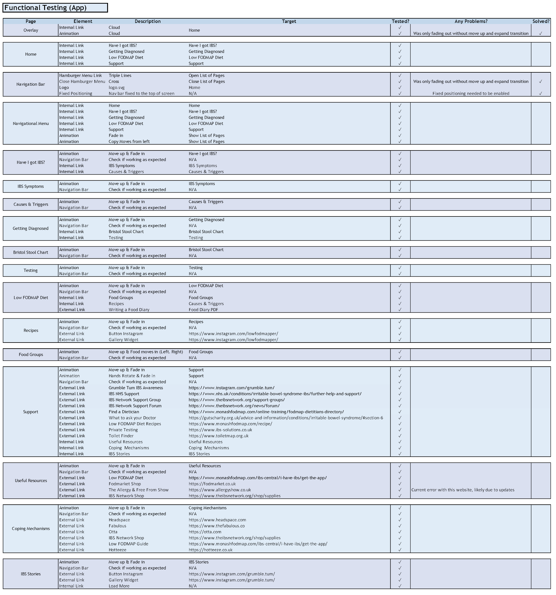
As I did with my finished website, I decided to test my app prototype in the same methodical manner. I used Microsoft Excel to achieve this table. I went through each screen testing every link (external/internal), animation and positioning of content.

Print Font Update

Image
For my promotional material such as my cover letter and business cards, I changed my fonts so that the information on these documents were more legible and the words were easy to understand on first glance. For my portfolio website, I am using the font, Vibur for my headings. I really like this font as it closely resembles my handwriting style, however I realised that this can be difficult to read if the font isn't larger enough.  Therefore for my print material specifically, I am using Myriad Pro for my brand name as an alternative font from the graphic version and Lucinda Grande for my body text.

Instagram Paid Promotion

Image
Once I completed my promo video, I used it as a paid promotion on Instagram to gain insight on my audience and potentially increase impressions on my posts and profile visits. I started with a small promotion over six days to see whether this brought more engagement to my account. Using this technique as well as following accounts with interest in IBS has increased my follower count significantly and over time will grow creating more interactions with others in the community. As you can see from the images below, I am in fact reaching my target audience on this platform. Although the paid promotion hasn't generated many profile visits, it is useful to know who this ad was targeting more specifically. This was great to see, as it confirms that my posts are reaching the correct people who would benefit from the information on my social media account and website. To improve this reach, I would need to have a higher budget for promotions as this is the smallest promotion you can set on...